Problem Statement
Zaful.com website offers a more affordable fashion apparel, but the website is not accessible making it difficult to navigate and shop for items for individuals with disabilities.
Challenge
Identifying accessibility issues on Zaful.com and redesigning the website to be accessible and as close to the original design as possible with help of WCAG 2.1 guidelines.
Solution


The screenshots only display view port of the page. To view the complete page visit the figma file.
Let’s dive deeper into my process.
The two weeks of the project were divided in two phases
Phase 1
Accessibility Analysis
Re-Design
Phase 2
Step 1
Analysing 3 webpages with accessibility tools
Step 2
Manual inspection of the web pages
Step 4
Re- designing the elements
Step 5
Substituting elements
Step 3
Creating Accessibility Evaluation Report
Step 6
Polishing final design & preparing documentation
Phase 1 : Accessibility Analysis
Step 1:
Analysing 3 webpages with accessibility tools.
To begin the analysis of this website I used the following accessibility tools to conduct an automated test on the web-pages :- 1. Wave Evaluation Tool. 2. AXE DevTools: AXE Accessibility.


eg: Flashing and switching text
eg: Keyboard focus not visible
Step 2:
Manual inspection of the web pages
After the automated test, I conducted a manual inspection with the help of the easy check guidelines. In scenarios where the understanding of context, visual cues, and contextual hierarchy is essential, the tools failed to determine that because of their limited capability. Hence, in these situations, manual testing was carried out according to the specific guideline provided on the Easy Checks list on the WCAG website.
Step 3:
Creating the Accessibility Evaluation Report
The accessibility Evaluation Report was created with the help of the WCAG-EM Report Tool. It is based on Web Content Accessibility Guidelines Evaluation Methodology. Checkout the complete accessibility report here.
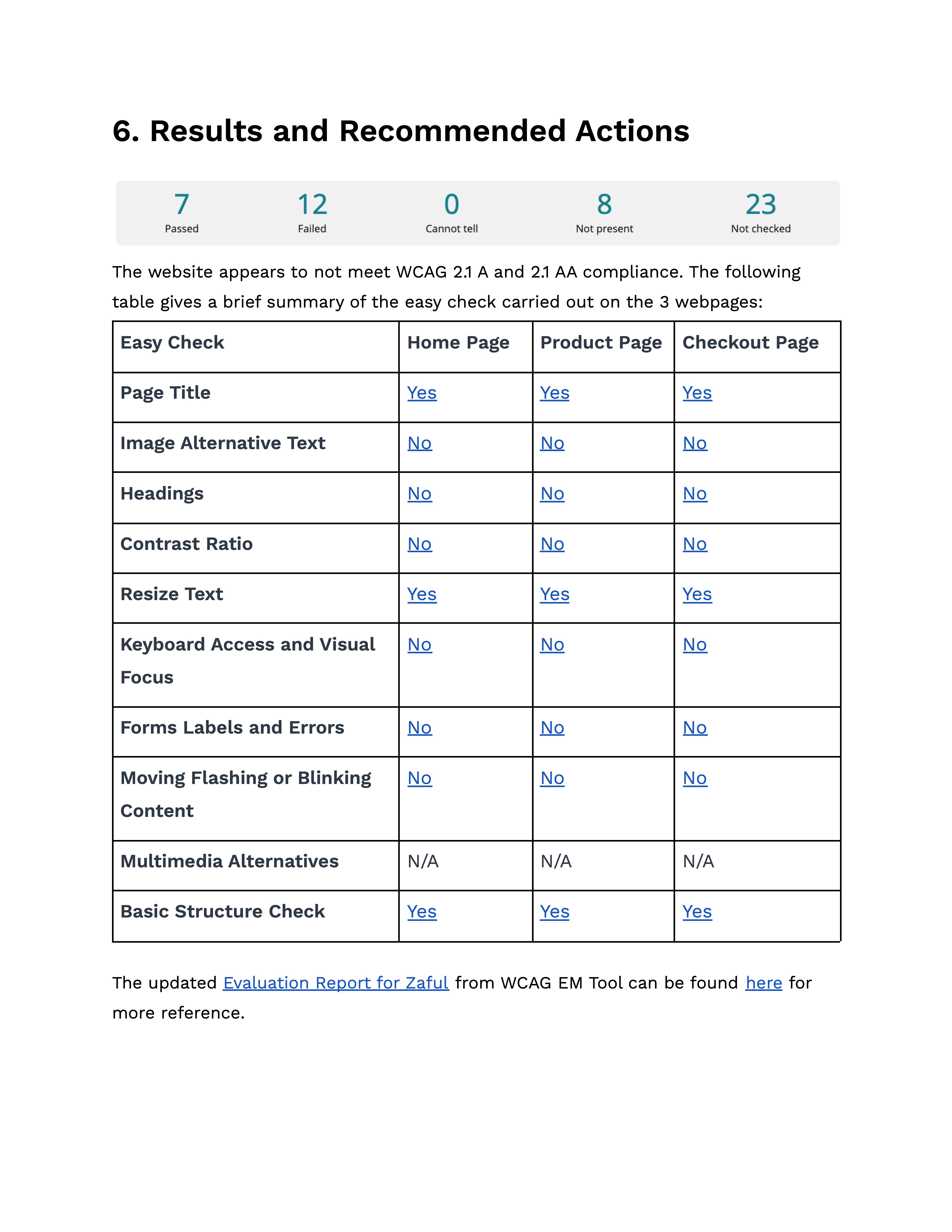
Evaluation Summary
Home Page
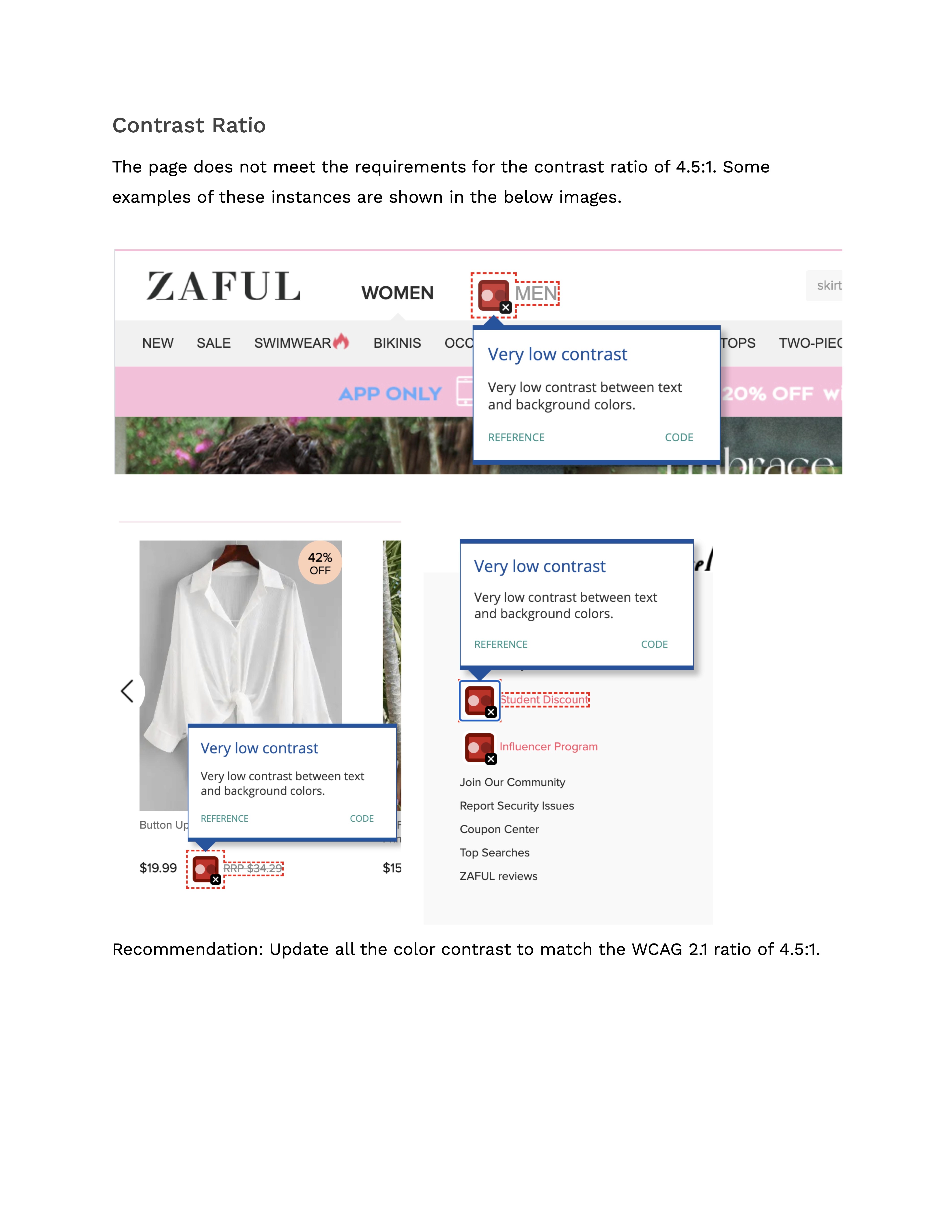
There are 166 - 175 color contrast issues that were detected
There are 105 - 511 images and non-text elements (including hidden elements) that do not have an alternative text.
The webpage does not have keyboard access.
There isn’t an informative label present for the search (forms, labels, errors)
There is a lot of moving, flashing and blinking content on the website which does not meet the WCAG 2.1 requirements.
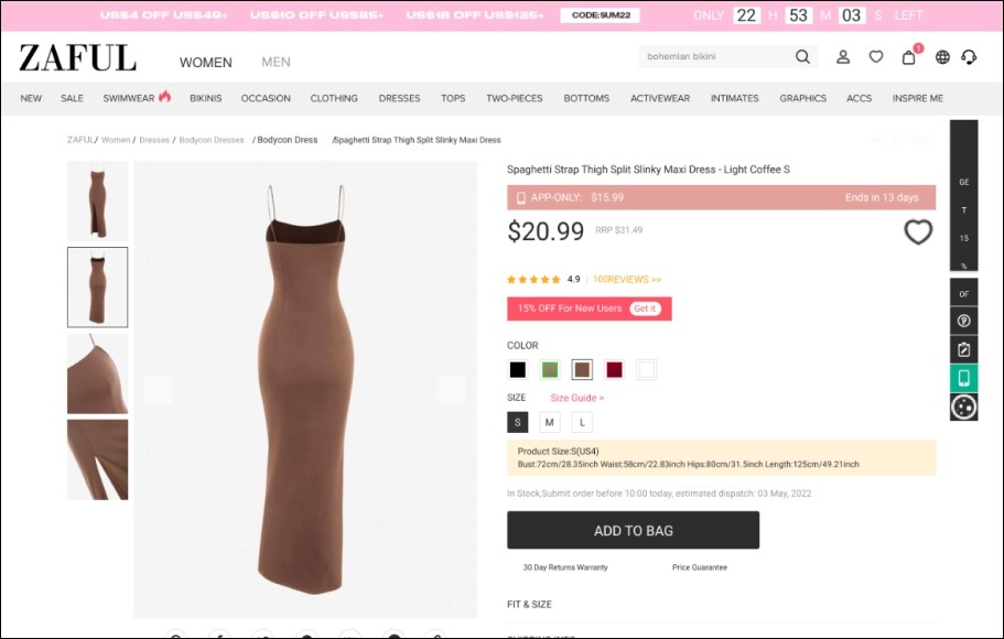
Product Page
There are 46 - 47 color contrast issues that were detected
There are 11 - 16 images and non-text elements do not have an alternative text. (There are hidden elements also that increases the count upto 419)
The webpage does not have keyboard access.
There isn’t an informative label present for the search form.
The moving, flashing and blinking content on the website does not meet WCAG 2.1 requirements.
Checkout Page
There are 18 - 21 color contrast issues that were detected
There are 5 - 7 images and non-text elements do not have an alternative text. (There are hidden elements that increase the count to 398)
The webpage does not have keyboard access.
There isn’t an informative label present for the search form.
The moving, flashing and blinking content on the website does not meet WCAG 2.1 requirements.
Phase 2 : Re-Design
Step 4:
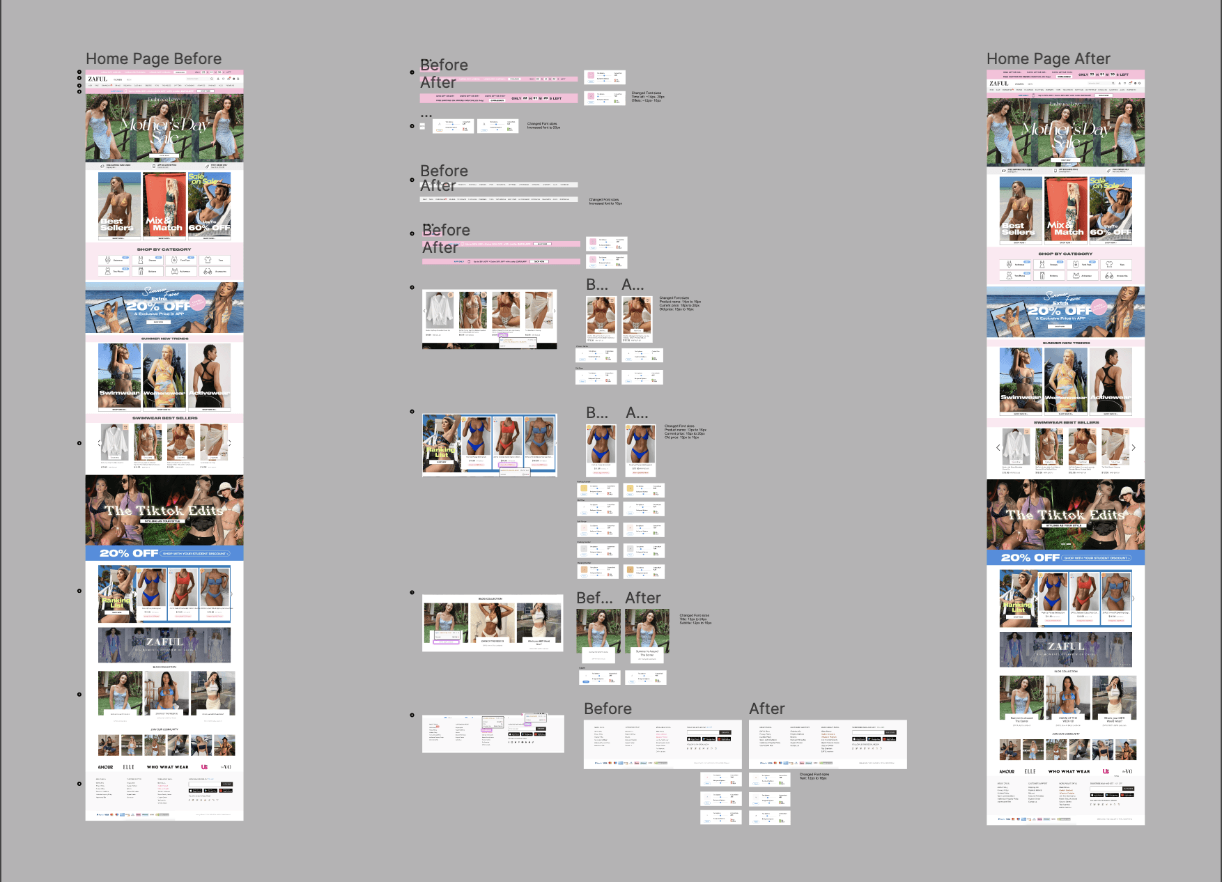
Re-designing the Elements
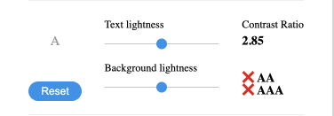
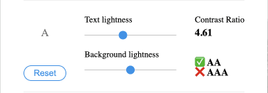
Various elements on the webpages were re-designed to meet the WCAG 2.1 guidelines. Major changes were focused on contrast and font size.
The contrast on the webpages was checked using the A11y-Color Contrast Checker plugin in Figma to make sure that the re-designs meet the contrast requirements.


Step 5:
Substituting the elements
I assembled the new designs for the web pages by substituting the elements that did not meet the requirements with the elements that did.
Step 6:
Polishing Final Design and Documentation
Once I incorporated the re-designed elements in the new design, I polished the design for presentation and documented the changes on the Figma file for easy comparability.
The Final Result:
View the complete documentation of the changes and the full webpages in the files below.
Looking Back:
If I had more time I would have gone beyond the easy checks in the WCAG report and analyzed a few more pages in the user’s flow.
I learned how to carry out end-to-end accessibility testing of a product.
In the future, I would want to pay special focus to accessibility in all my projects going forward and make it a part of my process.